I have had the continual privilege of illustrating and designing the invitations for the American Civil Liberties Union of Southern California's and Bill of Rights Awards and Annual Luncheon, the primary annual fundraising events for the organization in Los Angeles.
In addition to raising support for ACLU SoCal, the events have served to honor and highlight the efforts of those who have advocated for civil liberties within the United States.
Art Directors: Christian Lebano, Jenna Pittaway
I had the wonderful opportunity to collaborate with the Birthdate Co. and Chelsea Cardinal on The Birthdate Book, a custom-tailored book of astrology for the individual. Each of the zodiac illustrations’ colours and specific signs changed depending on the person’s astrological information.
Art direction and photography by Chelsea Cardinal
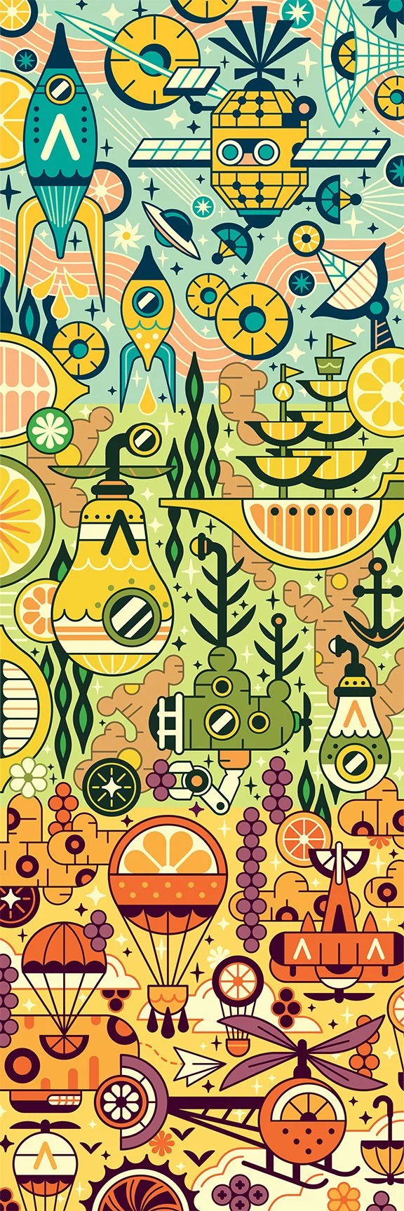
An illustration for The Walrus’ Summer 2022 July/Aug issue.
"Clearing Out: BC’s Logging Industry Sets Its Sights on the US" by Caitlin Stall-Paquet
Art Director: Celina Gallardo
Unused logo, branding and illustrations for a race/class narrative campaign in California.
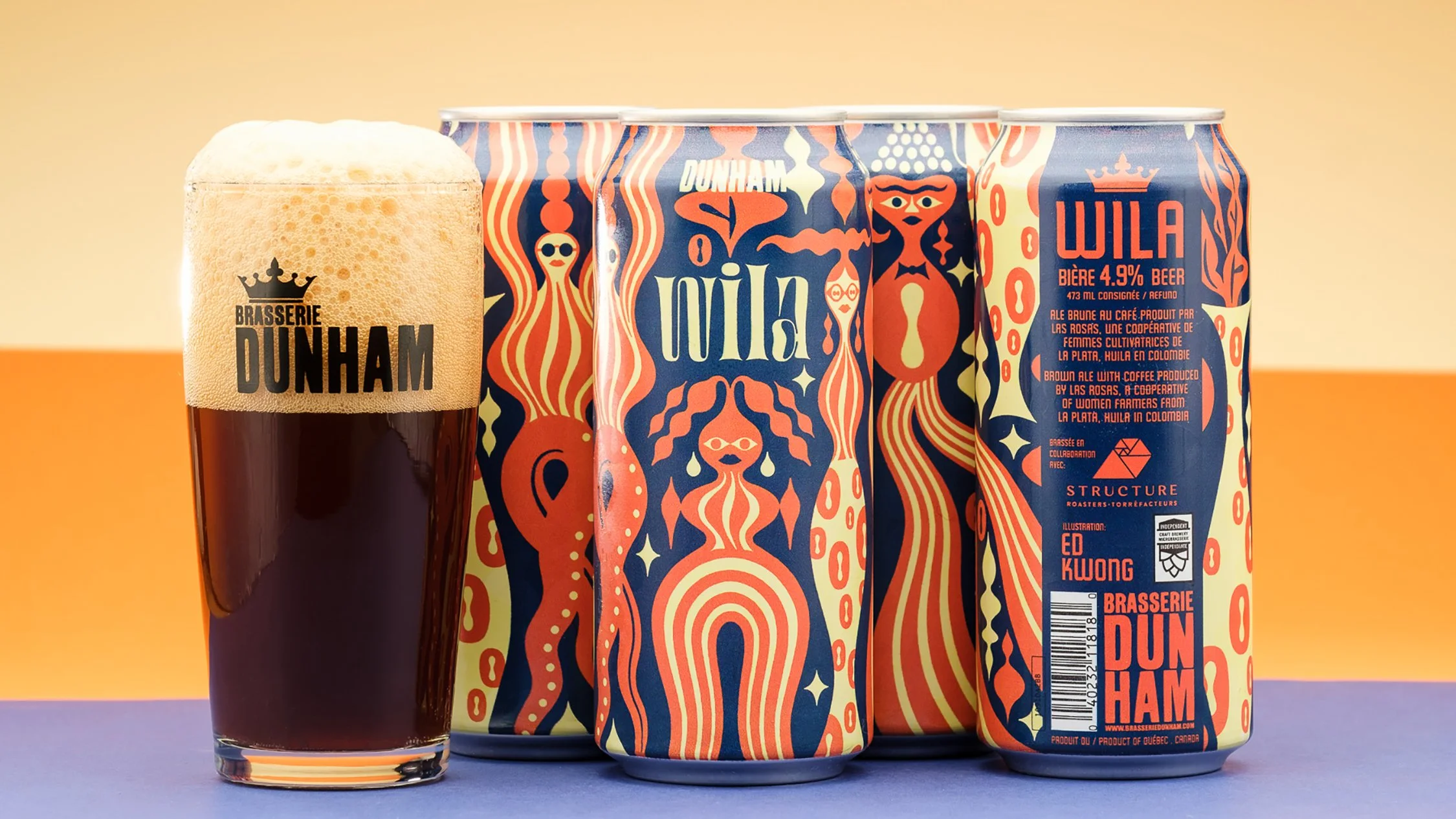
Wila, a brown coffee ale created by Brasserie Dunham and Structure Roasters using coffee produced by Las Rosas, a cooperative of women farmers from La Plata, Huila in Colombia.
Art Director: Simon Bossé
Photography: Olivier Bourget
Branding and illustrations created for We Make The Way — imagery that highlights the strong legacy of social justice activism and community organization in Colorado.
Branded illustrations created for the “We Make The Future” campaign leading up to the 2020 U.S. elections.
Logo, branding and illustrations serving to highlight the united efforts and goals of broad community coalitions working together across the US to secure a brighter progressive future.
I illustrated the cover for August 2015 issue of "The Review" by The National newspaper based in the UAE. It won the Award of Excellence in Illustration and the Award in Excellence in Features Design from The Society For Design in 2015.
"After Crimea and Ukraine, the Baltic States looked nervously to the East. With substantial ethnic Russian populations, some feared they could be the next point of tension in Eastern Europe. But historically, many Russians in the ‘Balts’ are happy in their adopted country, while Russia is too shrewd to make any move."
Art Director: Alex Belman
Branding and illustrations created for We Make Michigan — imagery that highlights the strong legacy of workers, unions and community organization in Michigan.
2019 Annual Report cover for the American Civil Liberties Union of Northern California.
Branding development (illustrations and logo) for Loop Parallel (Loop Mission)
Packaging design and photos by: Loop Mission
Art Direction: Jeanne Bertoux
Barrow Coffee Roasters reached out to me to help build their existing brand to include illustrations for coffee labels and more. The concept was to highlight the owner’s journey from an experienced heavy duty mechanic to a successful small business owner (who at the outset started off refurbishing his own espresso machines), and the local fauna of the province of Alberta.
https://www.barrowespresso.com/
Art Director: Katherine Wenger
Greater Than Fear is a progressive Minnesota campaign to promote unity and inclusiveness in the face divisive rhetoric and dog-whistling politics that have dominated the US political stage since 2016.
I designed the complete visual identity and all communications materials used to promote the campaign at public demonstrations and throughout social media in Minnesota.
I chose to use the official state motto, "L'Etoile du Nord" (The North Star) as the inspiration for the logo so it could symbolically serve as a guiding light for campaign objectives.
I wanted to highlight inclusivity, and local reverence for “The Golden Rule” (“the principle of treating others as one's self would wish to be treated”). The campaign imagery showcased familiar cultural experiences like sharing “hotdish” (the beloved Minnesotan name for all casseroles) at community gatherings and special occasions.
The Greater Than Fear Campaign was one of the finalists for the 2019 Shorty Awards — it was given the ‘Audience Honor in Goverment and Politics'.
Learn more about this campaign’s origins via the fantastic new podcast series, “Brave New Words” by Anat Shenker-Osorio, featuring Sharon Goldtzvik as well as others who contributed to the success of the Greater Than Fear - Minnesota campaign.
https://bravenewwordspod.com/greater-than-fear-minnesota/
“Brave New Words takes listeners on a journey around the globe with renowned communications researcher and campaign advisor Anat Shenker-Osorio as she unpacks real-world narrative shifts that led to real-world victories. From electing the dynamic Jacinda Ardern Prime Minister of New Zealand, to repealing a national ban on abortion in Ireland, to beating back right-wing race baiting in Minnesota, Anat and her guests explore what made it possible to engage the base, persuade the middle, send the naysayers packing, and win.”
Art Director, designer, illustrator: Ed Kwong
Photo: Greater Than Fear Twitter
Client: ASO Communications, Uprise, Education Minnesota, Faith in Minnesota, and SEIU Minnesota
A special crest was created for the Calcutta Cricket Club, a Bengali inspired Indian restaurant in Calgary, AB.
Art Director: Marc Rimmer
Promotional image for the World Wildlife Fund Canada’s Blue Montreal / Blue Resilience Project.
"With Blue Montreal, WWF Canada aims to breathe new life into Montreal’s aquatic ecosystems, give water back its rightful place in the urban landscape, improve water management and strengthen resistance to climate change. Five boroughs have already been targeted and three types of revitalization work have been proposed: daylighting an underground river, building a new urban river or developing blue alleys." - WWF Canada
Art Directors: Laurence Cayer-Desrosiers, Sophie Paradis
Tejo, a summer beer brewed with Colombian coffee and inspired by the Colombian flag and the country’s national sport of “Tejo” (a traditional throwing sport with explosive gunpowder targets). Brewed by Dunham in collaboration with Structure Roasters.
Art Director: SImon Bossé
Photography: Brasserie Dunham
I designed a series of collectible silkscreen posters and various for Chez Boris, a Russian cafe and donuts shop located the Mile End neighbourhood of Montreal. The designs were inspired by the rich tradition and beauty of Russian folk art.
Chez Boris logotype designed by Marc Rimmer
Purchase prints through Inprnt
A promo piece for one of my favorite foods.
I created a holiday wrapping paper for Drawn and Quarterly Publishing’s 25th Anniversary. It pays homage to the Montreal Mile End neighbourhood where the Librarie Drawn & Quarterly is located.
Art Direction: Tracy Hurren
In collaboration with designer Marc Rimmer, I created illustrations for a two part logo for Two Penny, a modern Chinese inspired restaurant in Calgary. Its design reflects the dual nature of restaurant’s bright ground floor dining space in contrast to The Tea House, an intimate underground bar and comedy club below.
Branding for The Tea House grew to incorporate a more playful cat motif to promote the various events and activities of the bar.
Art Director: Marc Rimmer
Photography: Marc Rimmer
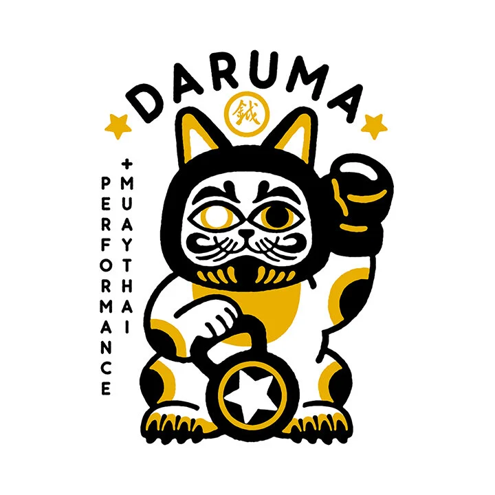
Logo design and collateral illustration for Daruma Performance and Muay Thai, a strength and conditioning gym and Thai kickboxing school based out of Richmond, BC.
I made a poster for "Le Pick-Up", a beloved local diner and corner store in the "Mile-Ex" district of Montreal.
Spot illustration of Little Miss Muffet to accompany the poem, “A Country Breakdown” by Henry Rathvon.
Published online for The Art of Eating.
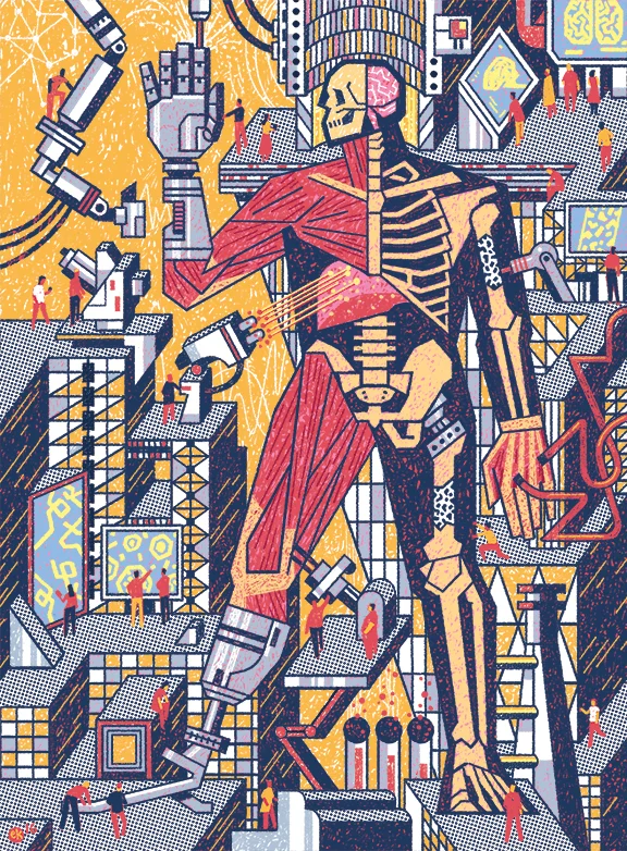
A full page for the McGill Alumni Magazine about the vast breadth of McGill University's Biomedical Engineering Department.
Art Director: Daniel McCabe